Smart Watch
Yellow can be a good UI color
smart watch
2024
About
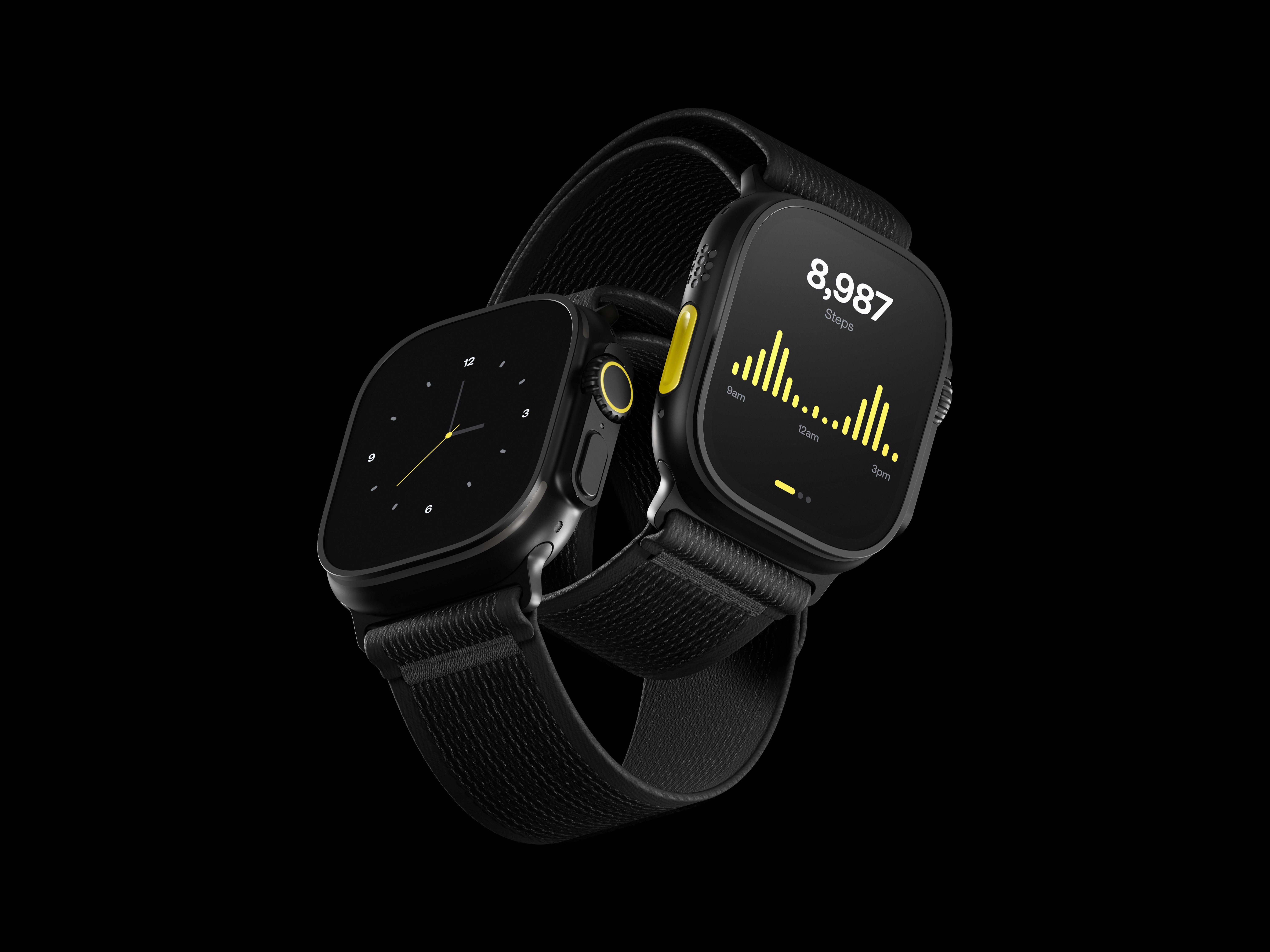
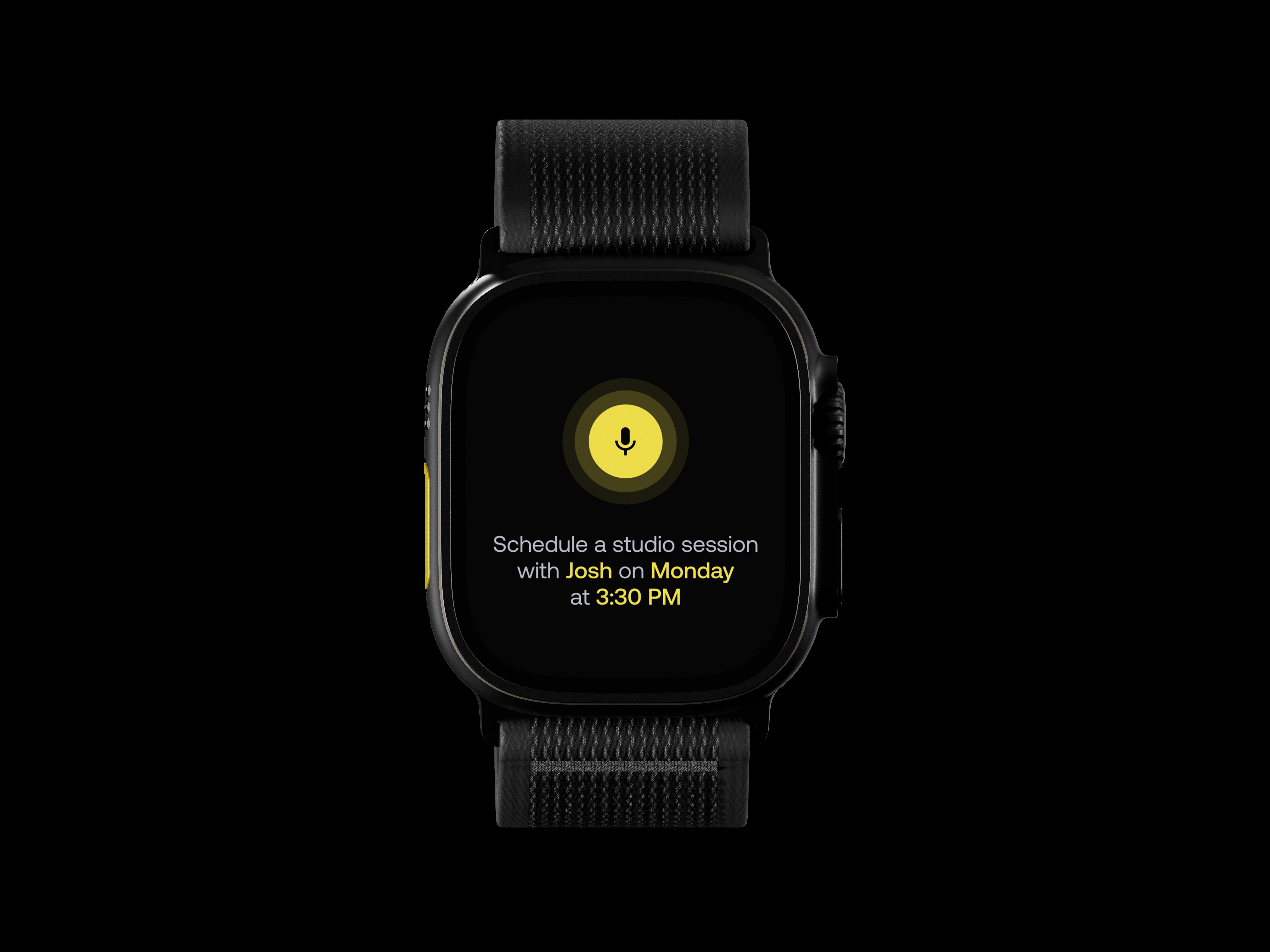
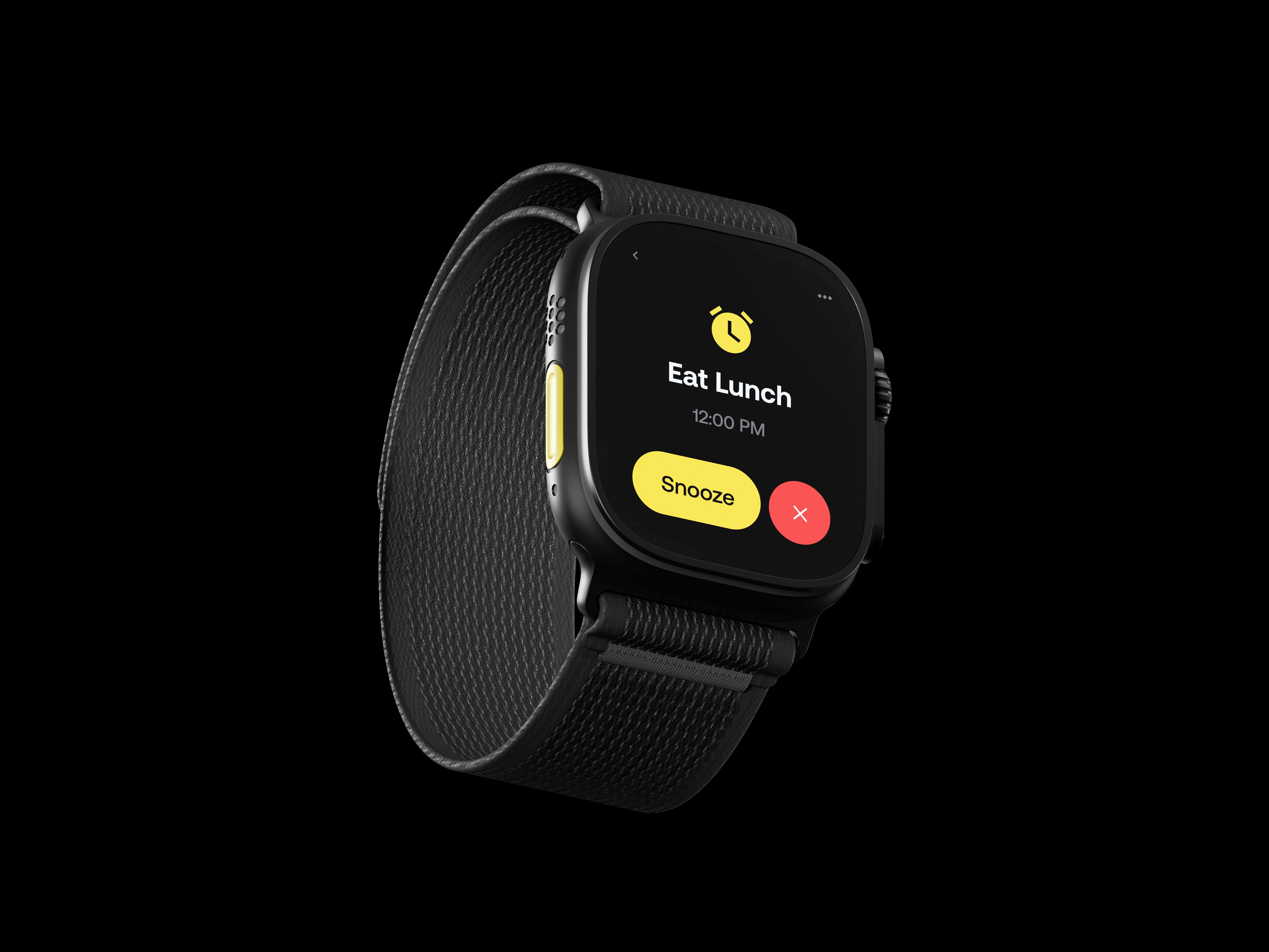
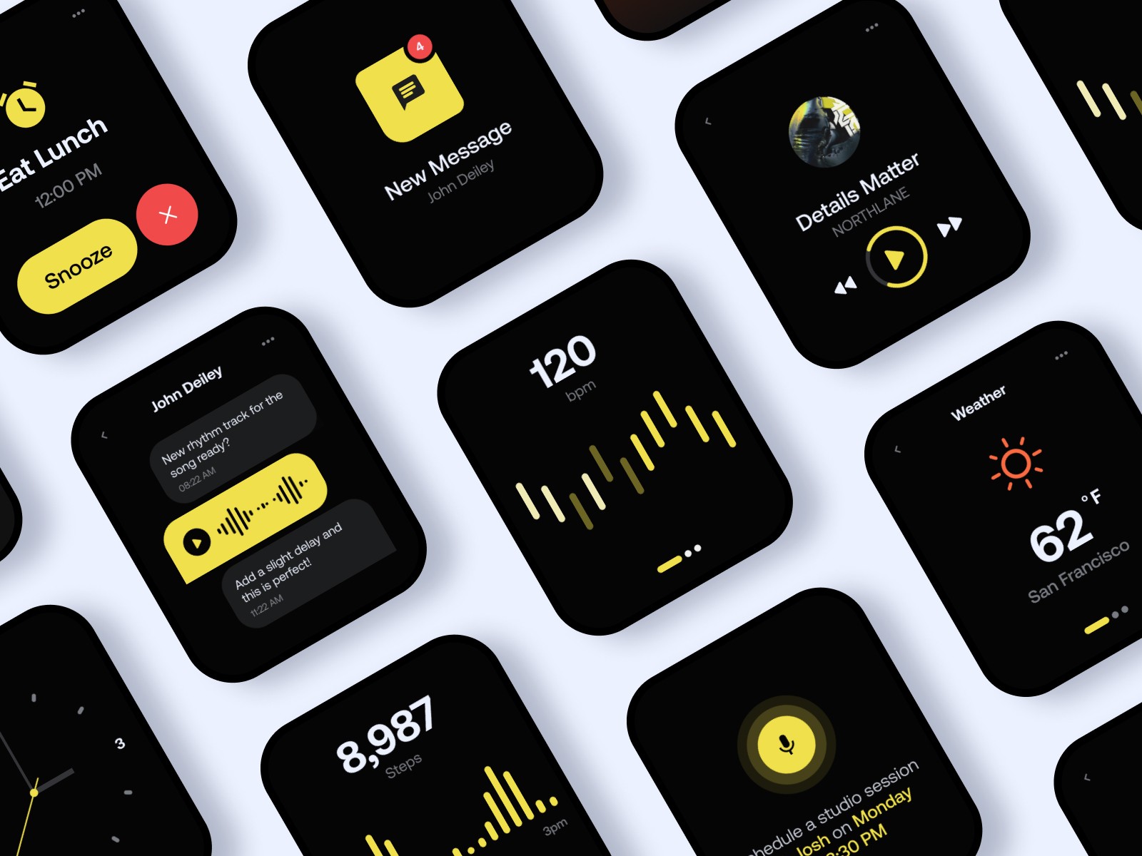
In this design exploration, I set out to address common UI/UX issues, particularly in the context of smaller screens, like those on smart watches. My focus was twofold: experimenting with the often-maligned color yellow as a primary branding element and rethinking the user experience for such compact interfaces.
